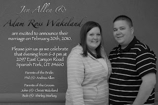
I've been wanting to get a little feedback on these invitations. I've been toying around with them in different colors and with slightly different effects. The first one is our most preferred. So they're basically in the order most liked to least liked. The info (times and addresses) aren't right, they're just sort of place holders for the final draft so we can see what it would look like.

Oh, and I should mention that the photography was done by Rick Brimhall. So kudos to him on getting a few good shots in of us.
So, what do you think?


 Sweet little Janie Roe will look so adorable in this little dress.

